I am a Data Scientist for the City of Toronto and my objective for this project is to illustrate how citizens can use Open Data to create their own tools and dashboards to understand their locality better. Here is the application I developed.
My code can be found on GitHub and if you’re a visual learner, feel free to follow my short video series on this topic (Work in Progress).
Collecting and Manipulating the Data
The City of Toronto has a massive collection of Open Data that consists of anything from parking tickets to elections results. This is actual up to date information in multiple different formats. In other words, this data can be relevant in understanding the city and addressing key issues of the day.
For this project, I’m interested in building an application that can help citizens track permits active permits in their area. Got a noisy neighbour doing some renovations on their house? Or maybe you’d like to know how much it cost them to build that second story on their place. Why not check what permit they applied for? Thinking of renting an apartment? Check what rent permits the landlord applied for. The data exists, but unfortunately not in an easily accessible format for the general public. We’re here to change that.
Datasets
Before working with the data, a few things need to be initialized. You are required to set up your working directory in R and load the packages so you can use their respective functions.
# Set your working directory (where all your files are stored) in the R > Studio Console
# setwd("Your/Path/Goes/Here")
Load packages in R (don't forget to install them)
library(stringr)
library(shiny)
library(dplyr)
library(DT)
library(leaflet)
Building Permits – Active Permits
- Active Permits (CSV) – Key Fields:
- PERMIT_NUM – Identifier for the Permit
- PERMIT_TYPE – Text categorizing the type of permit
- STRUCTURE_TYPE – Identifies that type of structure
- WORK – Overall type of work covered by the application
- ADDRESS – calculated string field by aggregating the number, name, type, direction and postal code
- STREET_NUM
- STREET_NAME
- STREET_TYPE
- STREET_DIRECTION
- POSTAL
- GEO_ID – unique ID that can be used to join the data to the Address Points data set to get Latitude and Longitude for mapping
- APPLICATION_DATE – The date the application was received by the City
- ISSUED_DATE – The date the permit was issued
- DESCRIPTION – Detailed description of the work
- EST_CONST_COST – Estimated cost for construction (not always a numeric field – needs to be cleaned)
# Load the Active Permits data
permit_data <- read.csv(“activepermits.csv”)
Address Points
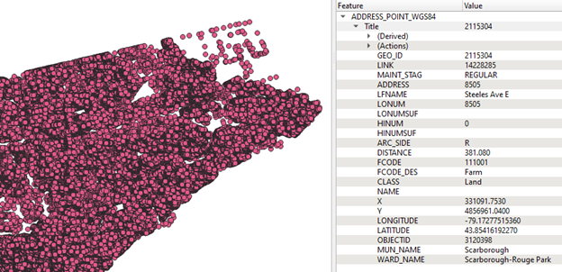
- Address Points (SHP) – This is a very important repository of data when working with mapping. It contains over 500,000 active addresses within the City of Toronto. It should be noted that expired GEO_IDs are not included in this data set. For example, if a house (19 Fake Street) is broken down and the property is split to build two new houses (19a and 19b Fake Street), then the GEO_ID for the original house (19 Fake Street) will not be in this data. As you might imagine, this causes a problem for permit data. After joining the data, I discovered that 5.4% of the GEO_IDs (from the Permit data) did not exist in the Address Points data set so they were excluded from the mapping portion of this Dashboard. However, I made the decision to keep them in the tabular view for completeness.
- Key Fields:
- GEO_ID – unique ID
- LATITUDE – needed for mapping visualization
- LONGITUDE – needed for mapping visualization
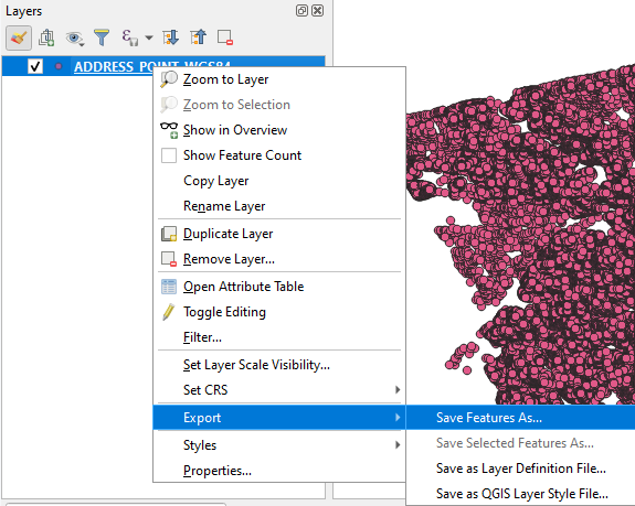
- The data is stored in a shape file and although R might have packages to deal with extracting data from those types files, I wanted to limit the number of packages used for this application. I used QGIS to convert the data in the shapefile to a csv
# Load the QGIS extracted Address Points data
geo_id_data <- read.csv(“GeoIDs.csv”)
Manipulating the Data
Before I built the WebApp, I wanted to create some new fields to make the dashboard more user friendly.
- There’s no need for a column for a Street Number, Name, Type, and Postal Code when you can have one combined address field.
- When filtering people aren’t interested in specific Application Dates, they’d rather just pick a year. This is a concept decision made to allow of ease of filtering especially with complicated date formats.
- There’s an Issued Date and an Application Date, but most of the time people don’t want to do the mental gymnastics to calculate how long it took to get a certain type of permit.
- The Estimated Construction Cost field (EST_CONST_COST) contains both numerical and text data. Remove the text data to allow the data to be sorted by cost.
I created 3 new fields to increase the usability of the dashboard to address these issues.
1. Combined all the address fields into one field. This is a little more complicated than it seems due to the street direction field that occasionally exists (ex. 20 Queen Street W).
The first part of the code removes any white space from the Street Direction field. This is required so we can check if the field is empty or not before concatenating the address.
# Remove extra white space from Street Direction field
permit_data$STREET_DIRECTION <- str_trim(permit_data$STREET_DIRECTION)
The Second part of the code checks if a Street Direction exists (if the length of the value is not 0), and the concatenates the address including the Street Direction. Otherwise, the concatenation ignores that field.
# Create an Address field
permit_data$ADDRESS <- ifelse(str_length(permit_data$STREET_DIRECTION)==0,
paste0(permit_data$STREET_NUM," ",permit_data$STREET_NAME," ",permit_data$STREET_TYPE,
       ", ",permit_data$POSTAL),
paste0(permit_data$STREET_NUM," ",permit_data$STREET_NAME," ",permit_data$STREET_TYPE,
         " ",permit_data$STREET_DIRECTION,", ",permit_data$POSTAL)
)
2. Extracting the Application year is quite simple using the Stringr Package. We just take the last 4 characters in the Application Date field.
# Create an Application Year Field
permit_data$APPLICATION_YEAR <- str_sub(permit_data$APPLICATION_DATE,-4,-1)
3. In order to calculate the time between application and issue, you need to ensure that both fields are dates. Then some simple algebra will return the desired results. Unfortunately this number is in days and we would need ot use extra R packages to convert number of days to years/months.
# Calculate the Time between Application and Issued date
permit_data$time_to_issue <- as.Date(as.character(permit_data$ISSUED_DATE), format=”%m/%d/%Y”)-
as.Date(as.character(permit_data$APPLICATION_DATE), format=”%m/%d/%Y”)
4. After checking the data in excel, I noticed that the EST_CONST_COST field is usually a numeric field, but occasionally has the following line of text: “DO NOT UPDATE OR DELETE THIS INFO FIELD”.
Hence, the first step is to remove this string of text and then order the data by cost descending.
# Remove “DO NOT UPDATE OR DELETE THIS INFO FIELD” from EST_CONST_COST field
permit_data$EST_CONST_COST <- str_replace(permit_data$EST_CONST_COST,”DO NOT UPDATE OR DELETE THIS INFO FIELD”,””)
# Sort by Construction Cost
permit_data <- permit_data
The last step in the data manipulation is to join the geospatial data from the Address Points layer and create a new dataframe that will be used to populate the map. An inner join was used to merge the two dataframes to avoid null values in latitude and longitude which cause errors in Leaflet.
# Inner join to get mapping coordinates for applicable GEO_IDs
pdwc <- merge(x=permit_data, y=geo_id_data, by=”GEO_ID”)
Building a Web Application
The R package we’ll be using to create the dashboard is Shiny. It’s great at handling data sets under 1 million records and providing custom visualizations that can be viewed on a web browser. There’s no need of paying or installing expensive software to create/use the dashboards! Furthermore, there is minimal web development skills required to build the application.
Shiny breaks down the WebApp into two major components:
- UI (User Interface) – This is the layout of your application. You can decide where you want to place you filters and output charts
- Server – The server takes all the user inputs form the filters and processes the results to provide outputs that then dynamically update the charts in the UI
It’s that simple. Now to breakdown how I designed and developed my dashboard.
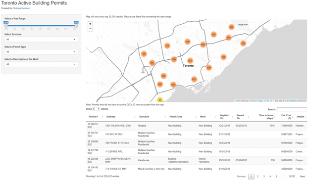
UI (User Interface)
The UI is split between a side panel that will gather the user input and a main panel that will display the output in a map and table. Both these components are wrapped within a fluidPage() function and assigned to a variable called “ui”.
Sidebar Panel
# Sidebar panel for inputs —-
sidebarPanel(
# Input: Select Year —-
sliderInput(inputId = “year”, “Select a Year Range”, min=1979, max=2020, value=c(1979, 2020), sep = “”),
# Input: Select Work —-
selectInput(inputId = “s_type”, “Select Structure”, choices=c(“All”, sort(unique(as.character(pdwc$STRUCTURE_TYPE))))),
selectInput(inputId = “p_type”, “Select a Permit Type”, choices=c(“All”, sort(unique(as.character(pdwc$PERMIT_TYPE))))),
selectInput(inputId = “w_type”, “Select a Description of the Work”, choices=c(“All”, sort(unique(as.character(pdwc$WORK))))),
width = 3)
Main Panel
# Main panel for displaying outputs —-
mainPanel(
# Let user know of mapping restriction —-
h5(“Map will only show top 20,000 results. Please use filters like shortening the date range”),
# Output: Map of Geo_IDs
leafletOutput(“mymap”, height=520),
h5(“Note: Permits that did not have an active GEO_ID were excluded from the map.”),
# Output: Table of Work Done —-
dataTableOutput(‘table’) )
Server
The server is a function of input submitted by user, the current output of each chart and the active session.
server <- function(input, output, session) {
# Server code here
}
Filtering the Data
The first step is to create a function that will filter the dataframe based on the user input. The code below creates a function filtered() that gets the input from the max and min of the year slider, the selected structure, permit and work types and returns a subset of the permit_data dataframe with those filters applied. This is a reactive function because it reacts to any changes in the filters and updates everything.
filtered <- reactive({
rows <- (permit_data$APPLICATION_YEAR<=input$year & permit_data$APPLICATION_YEAR>=input$year) &
(input$p_type == “All” | permit_data$PERMIT_TYPE==input$p_type) &
(input$w_type == “All” | permit_data$WORK==input$w_type) &
(input$s_type == “All” | permit_data$STRUCTURE_TYPE==input$s_type)
permit_data
})
Updating the Filters to Reflect Current Selection
The next thing to do is to update each of the input filters based on the year filter. The observeEvent and updateSelectInput functions in Shiny allow you to check if the date range has been change and then to update the filters with all acceptable values. The same combination of functions is used to make sure only allowable values are picked based on the current input for the structure, permit, and work types respectively.
observeEvent(
input$year,{
updateSelectInput(session,”s_type”,choices=c(“All”, sort(unique(as.character(filtered()$STRUCTURE_TYPE)))))
updateSelectInput(session,”p_type”,choices=c(“All”, sort(unique(as.character(filtered()$PERMIT_TYPE)))))
updateSelectInput(session,”w_type”,choices=c(“All”, sort(unique(as.character(filtered()$WORK)))))
})
Generating an Output Table based on Filters
The final output table is generated by taking in the filtered() data and sub-setting specific columns that will be outputted based on the results. The renderDataTable function is used to generate this table. I manually changed the names of the columns to make them more user friendly.
observe({
output$table <- renderDataTable(select(filtered(),PERMIT_NUM,ADDRESS,STRUCTURE_TYPE,PERMIT_TYPE,WORK,APPLICATION_DATE,ISSUED_DATE,time_to_issue,EST_CONST_COST,DESCRIPTION),
colnames=c(“Permit #”,”Address”,”Structure”,”Permit Type”,”Work”,”Applied On”,”Issued On”,”Time to Issue (days)”,”Est. Cost ($)”,”Details”),
options = list(pageLength = 5, width=”100%”, scrollX = TRUE)
, rownames= FALSE
)
})
Creating a Map Output
The map had a couple of restrictions that needed to be addressed before generating the output. The first is that Leaflet (the mapping provider) does not handle null records well. Therefore, I could not use the filtered() function created for the table. A new filtered_map() function was created to only select non-null geospatial records. The top 20,000 records (by EST_CONST_COST) were taken to not stress the mapping server.
filtered_map <- reactive({
rows <- (pdwc$APPLICATION_YEAR<=input$year & pdwc$APPLICATION_YEAR>=input$year) &
(input$p_type == “All” | pdwc$PERMIT_TYPE==input$p_type) &
(input$w_type == “All” | pdwc$WORK==input$w_type) &
(input$s_type == “All” | pdwc$STRUCTURE_TYPE==input$s_type)
#pdwc
head(pdwc,20000)
})
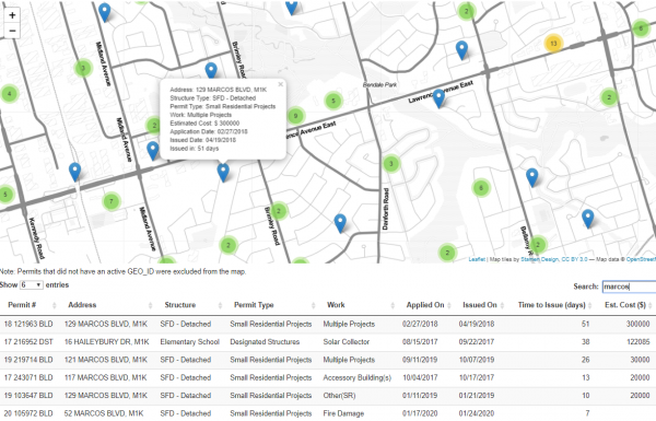
The map is then rendered, with a tooltip to allow users to click on points and get more information. The points are clustered for viewability.
output$mymap <- renderLeaflet({
leaflet() %>%
addProviderTiles(providers$Stamen.TonerLite,
options = providerTileOptions(noWrap = TRUE)
) %>%
addMarkers(lng=filtered_map()$LONGITUDE, lat=filtered_map()$LATITUDE,
popup=paste(“Address:”, filtered_map()$ADDRESS, “<br>”,
“Structure Type:”, filtered_map()$STRUCTURE_TYPE, “<br>”,
“Permit Type:”, filtered_map()$PERMIT_TYPE, “<br>”,
“Work:”, filtered_map()$WORK, “<br>”,
“Estimated Cost:”,paste(‘$’,as.integer(filtered_map()$EST_CONST_COST)), “<br>”,
“Application Date:”, filtered_map()$APPLICATION_DATE, “<br>”,
“Issued Date:”, filtered_map()$ISSUED_DATE, “<br>”,
“Issued in:”, filtered_map()$time_to_issue,”days”),
clusterOptions = markerClusterOptions()
)
})
The final step is to call the ShinyApp and then check your output. And there you have it, how to create a WebApp in under 200 lines of code without any web development skills required. All in R with only 5 external packages and a little bit of a creativity!
# Create Shiny object
shinyApp(ui = ui, server = server)